from seal to signature
every stage my mmmc mark went through: michael, mario, matthew, capozzi, from a stiff little library seal to the loose, mis-pressed rubber stamp it became. each step below is the live mark, rebuilt the way it looked at that moment (nothing here is a screenshot).
where it started
the ask, pasted exactly as i sent it. no cleanup, no paraphrase:
I’m looking to create a brand identity for me, I have colors like what’s attached. My website is www.michaelcapozzi.me and you can use that for reference. I am looking to create a logo, and i think a clever way to delineate me is that my name is Michael Mario Matthew Capozzi when you count the middle / confirmation name (catholic thing) so I would like to stick with MC branding and have a logo like
- Use four letters MMMC
- Emulate a book stamp like in a library that you would see in a rented book
- Stick with MC branding
- Have 1 M be the darkest, C be somewhere askew with it and be a little lighter, then 2 more askew Ms that look like someone forgot to press the M and tried 2 more times in essence you will see a MC and 2 more light Ms
and the concept scraps that went with it:
- 1v0.1 · first idea
the library seal
started literal. an official round stamp, the full name arced top and bottom, pressed in a single flat ink. it read like a notary seal: correct, but stiff, and the border did all the talking.
- 2v0.2 · reframe
the box frame
swapped the circle for a rectangular date-stamp frame. a little more modern, but same problem: the frame was the identity, not the letters inside it.
- 3v0.3 · strip it
drop the frame
killed the borders entirely. just the 4 initials: michael mario matthew capozzi, reading as mc, with the ghost presses creeping behind. the mark finally had to carry itself, and it did.
- 4v0.4 · type audition
hunting a face
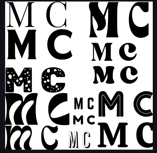
tried 10 letterforms. rounded, friendly faces like baloo 2 (front and center) were warm, but a touch too soft to feel like a signature that's been pressed a thousand times.
- the audition
the 10 letterforms
the bare mark, same misprint, same red and blue press, set 10 ways. caprasimo (01) won.
01caprasimo · house 02calistoga 03lilita one 04titan one 05chango 06baloo 2 07croissant one 08yeseva one 09fredoka · rounded 10paytone one - 5v0.5 · locked
caprasimo locks in
settled on caprasimo. the same warmth, with more weight and a little more class in the curves. this became the voice of the mark, and it hasn't changed since.
then i tested flipping the press order. 1234 stacks darkest first, so the lighter ghosts wash over the m the way real re-presses would. 4321 flips it, dark m crisp on top. same 4 taps, 2 different reads, and 4321 is the keeper: the misses should sit behind the mark, not wash across it.
1234 · darkest first, ghosts wash over 4321 · dark m crisp on top - 6v0.6 · the story clicks
color & 2 ghosts
brought in my 5-color palette: a red c tilting off a charcoal m, with a blue and a sage ghost m behind for mario & matthew. the “pressed 3 times to get it right” idea finally clicked.
- 7then → now→v0.7 · texture rebuild
the speckle wins
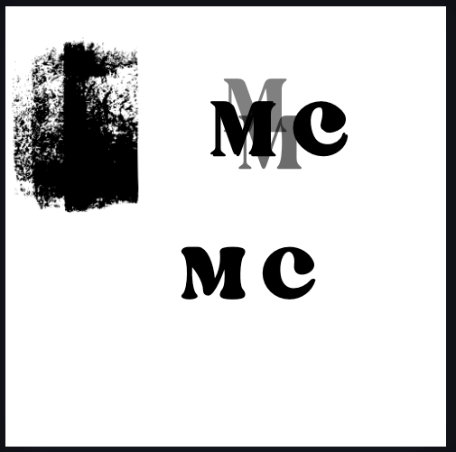
the early grit punched hard, uneven holes (left). tried a soft, bleeding ink, then landed on a crisp, even speckle (right), like a stamp catching the tooth of the paper. that's the one.
- 8v1.0 · final
the mark
full color, an inky speckle, 2 ghost presses each dialed on their own, and the ghosts laid down first so the dark m lands crisp on top. same joke it started as (a stamp pressed until it was right), just finally loose enough to feel true.
the press
every dial that shaped the mark, live. put the frame back on to see the library seal, run the letterform audition yourself, flip the press order, or repaint all 4 letters. it’s the same mark this whole page is drawn with; there’s no image to swap.
press it yourself
color variations
caprasimo and my 5 brand colors, mixed across the 4 letters. these are starting points, numbered so i can point at one (c03, c07).
anatomy of a misprint
favicon & avatar
the 2 smallest drop the ghosts and the grit; below roughly 24px they turn to mud. these are the real favicons this site uses.
usage
- keep the ghost m’s faint: they should whisper, not shout
- give it breathing room; the grit needs air to read as ink
- drop the ghosts & grit below ~24px for clean favicons
- don’t recolor the c into a ghost tone, or the mc stops reading
- don’t straighten the c; the tilt is the personality
- don’t stack it on a busy photo without a solid patch behind